Clients
Here are a few case studies of my work:
MOO x Tom Dixon
Translating MOO’s creativity onto a physical canvas to convey its brand identity offline.
Needs
Tom Dixon took residency in Selfridges for 4 weeks to become the most talked-about and most visited 'design destination' during Fashion Week, Design Week, BFI Film Festival and the Frieze. Selfridges feels more like an adventure playground or immersive theatre than a selling machine and fittingly hosted a series of extraordinary 'stages', installations and events to attract fresh creative partners and customers. MOO was invited to showcase an innovative experience.
Action plan
MOO is a place where people define their identity on a white digital canvas. We wanted to create a physical version of it. We built a life-size installation of a ‘boring office space’ painted entirely in white — where people would unleash pistols, filled with colourful paint to stamp their own personality onto the environment. Customers would experience the brand’s values in real-life.
Impact
About 1,200 people experienced the stand: art buyers, journalists, bloggers, broadcast crews and photographers, consumers, festival goers, filmmakers — significantly increasing MOO’s awareness. The successful concept was rolled out globally.
Social
Press


Warm Up Festival
A new visual identity and website for a festival immersed in nature.

Needs
Warm Up is one of London’s most respected dance music rave communities. The founders were creating a sister-brand to bring the experience to a 3-day outdoor summer festival and needed a website to promote and sell the event.
Action plan
To engage their existing audience and welcome new party goers, the visual language needed to feel like a cohesive evolution of the original brand, while being independently identifiable. Warm Up’s founding DJ is the embodiment of the brand, which we needed to deconstruct and codify.
Impact
We translated the founder’s voice, values and event proposition into a brand language that was relaxed, playful and other-worldly. In addition to the website and brand guidelines, we designed visual effects and filters to easily imprint their brand through informal Facebook posts and marketing communications.

Mindful Peak Performance
Building a sleek brand identity and website for a new kind of training regime.
Needs
With new governmental pressure on sports organisations to address mental health, Mindful Peak Performance (MPP) created a training program that would enhance athletic performance beyond physical training, using mindfulness-based practices for individuals, institutions and teams.
Action plan
We began working with MPP at the very start of the company’s inception, pre-seed level. They wanted an entire brand direction. Most of their customer interactions (and conversion) occurred offline, but they needed a website to present the brand to a sceptical metric-focused audience, as a simple validation touch-point. They required a focused and authoritative identity to engage prospects.
Outcome
The final deliverables were a logomark, a responsive website and a user-friendly CMS. In addition, we provided guidance on their brand strategy, including SEO, domain names and productivity software.
Process
4 week project schedule
We researched competitors and synthesised contextual documentation shared by MPP.
Developed the visual design: logomark, fonts and wordmark; photography and colours.
Art directed and produced a photoshoot to create branded imagery.
Designed the information hierarchy and UX to help users clearly understand the offering and their next steps.
Created a UX copy strategy to fit and reflect the brand’s trustworthy, confident and youthful personality.
Built the website on a Squarespace framework, for a solid responsive foundation, with custom HTML and CSS code to realise the designs accurately.
One-team approach
This intensive two-week project was carried-out as a Design Sprint. We held generative research workshops with the team and their prospects, to gather both MPP’s and customers’ requirements, brand personality elements, mission and values, the broader context of their needs and build-out customer profiles (personas). This helped to focus their offering more precisely towards their primary market: competitive athletes.
The brand
A key part of creating the visual communication of the brand was their logo. This needed to communicate MPP’s core benefits: performance and well-being, while being simple, memorable and authoritative. The result is a logomark we call ‘the peak’: a ‘performance summit’ laid on a head-shaped base—symbolising meditation.
Future-friendly
We developed a website that MPP will be able to evolve independently, thanks to an easy-to-use CMS built with Squarespace and comprehensive brand guidelines. Along with the different assets we delivered, the output of our work will support their workflow both internally and externally, to:
Easily and cohesively communicate the brand to new business partners, prospects and customers
Faithfully represent the brand in PR collateral
Design the strategy, layout and language for pitches
Build out new website content modules as the product offering grows.
We also assisted the acquisition and transfer of the domain, created custom team email accounts with email signatures and designed necessary assets for external communication templates, like invoices and business cards, to create a cohesive communication system.
Have a look at the Mindful Peak Performance website yourself, here. They are the future of competitive sports!


Above: Imagery from the MPP photoshoot.
Society
Rebranding a hospitality business redefining travel accommodation through community.

Needs
d8 Hotels is a collection of townhouses in Shoreditch. When we met, they were evolving their business into a community-focused guest experience, and needed a rebrand to support this pivot.
Action plan
The founders wanted to secure capital to refurbish a 21-bedroom building, which required an investor deck to assert their new value proposition — defining their USPs, business model and offline and online strategy
Impact
To convey their ambition effectively, we selected a new name — Society — and produced a brand bible to define their positioning, personality, visual guidelines and tone of voice. Additionally, we hired and briefed an interior design firm to translate the brand into a physical experience. A commercial space with a bar, restaurant and club is also being developed and we advised the definition of this concept.

Design showreel
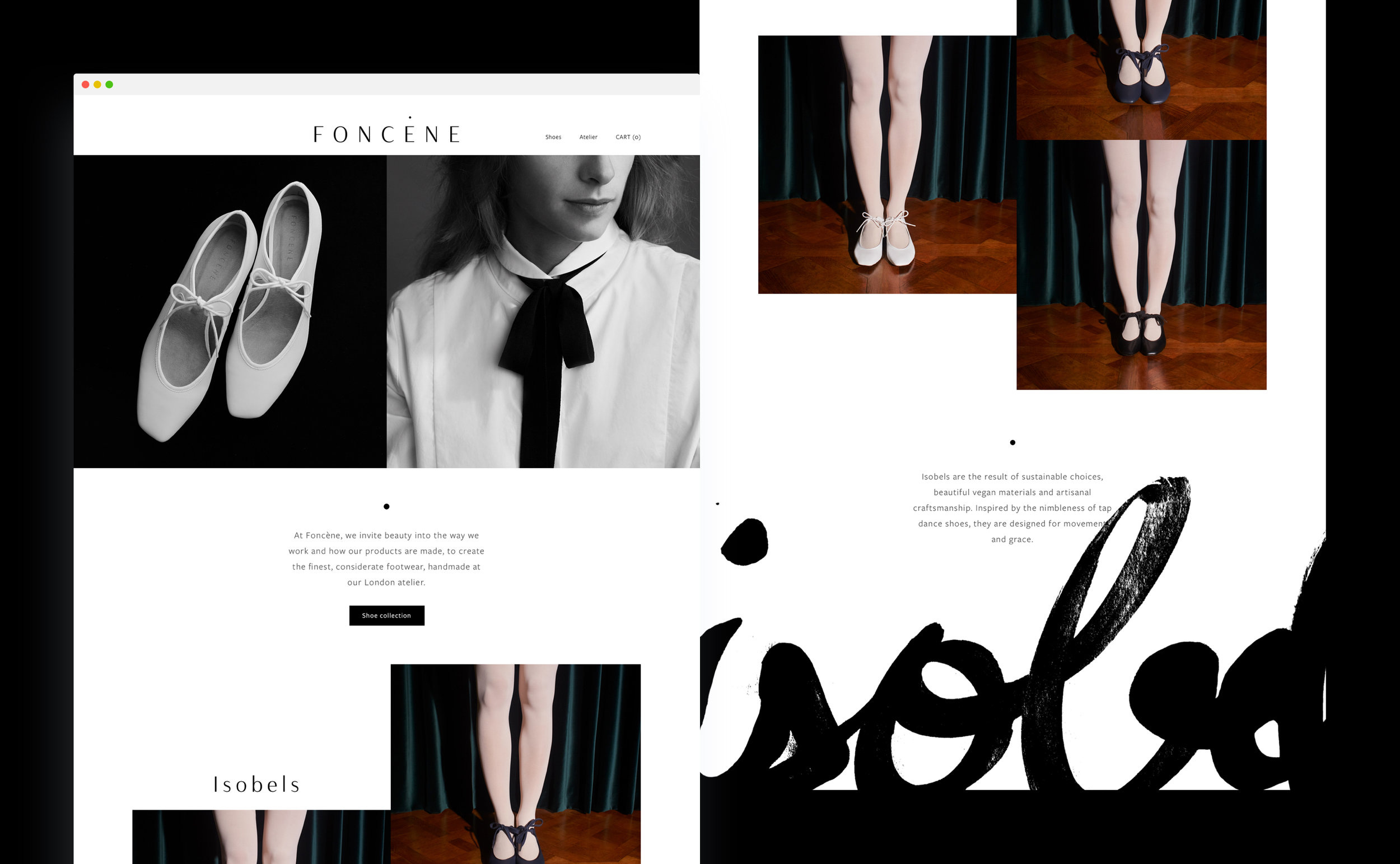
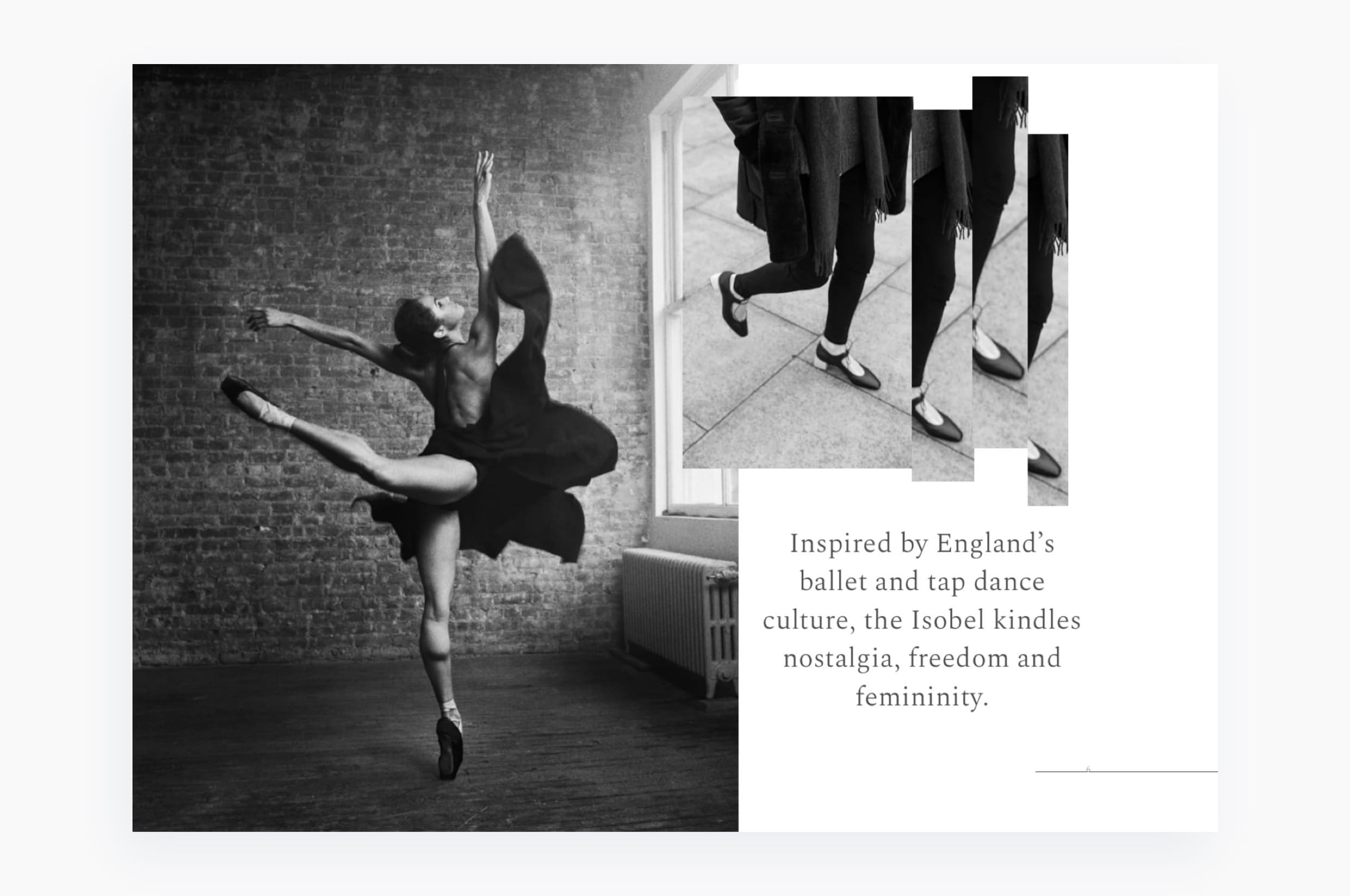
Foncène
Creating a brand identity that unifies luxury with long-term, ethical values.
Needs
Leather is believed to be one of the most harmful materials in use. Foncène wants to change this with handmade luxury shoes that do not compromise on aesthetics or ethics. Foncène is creating a digital brand adjacent to French heritage fashion houses with a youthful twist but without an ethical agenda.
Action plan
To reach a similar audience, we needed to communicate the value of Foncéne’s new products without alienating non-vegan audiences. A small team of artisans spend weeks handcrafting each shoe — taking immense care to achieve beauty and perfection. We decided to speak about the attention given to this process and worked on conveying this through their logo, copy, podcast, art direction, photography, fonts and website.
Impact
With a new identity that supported its mission, Foncène has captivated the Japanese cordwainers’ community — where beauty and craft are highly regarded. One well-respected artisan described the shoes as “Exquisitely beautiful […]”. Garnering praise from a traditional leather shoe-maker is a great testament to the brand’s language. 70% of Foncéne’s sales have been to non-vegan customers.


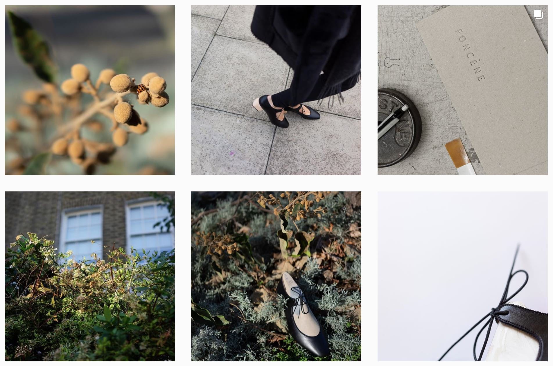
ART DIRECTED INSTAGRAM FEED
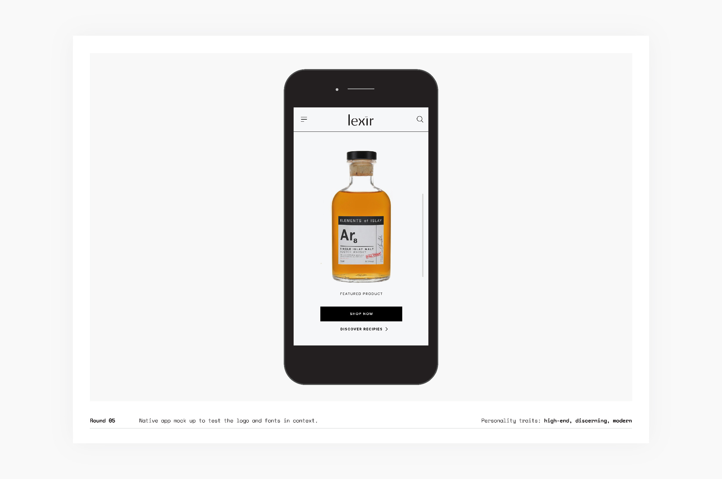
Lexir
Designing a brand logotype to convey premium and craft-inspired values.
Needs
Lexir helps the professional alcohol industry find new products and trade with better tools. The market they address are alcohol buyers (bar owners, bartenders), sellers (spirit brands) and creatives (brand ambassadors). They seek to grow the community’s culture organically while removing distributors from the transaction.
Action plan
We decided to create a brand kit starting with a logotype that embodied Lexir’s user-base, features and business model. It had to balance high-end visual aesthetics with an inclusive and approachable feel.
The two-week project was carried-out as a Design Sprint with the founding team, to gather both Lexir’s and their customers’ requirements, the brand personality elements, mission and values.
We researched competitors and synthesised contextual documentation shared by Lexir.
We built-out customer profiles (personas) to contextualise their brand needs, helping to focus their offering more precisely towards their primary market: buyers, sellers and creatives.
About the logo design
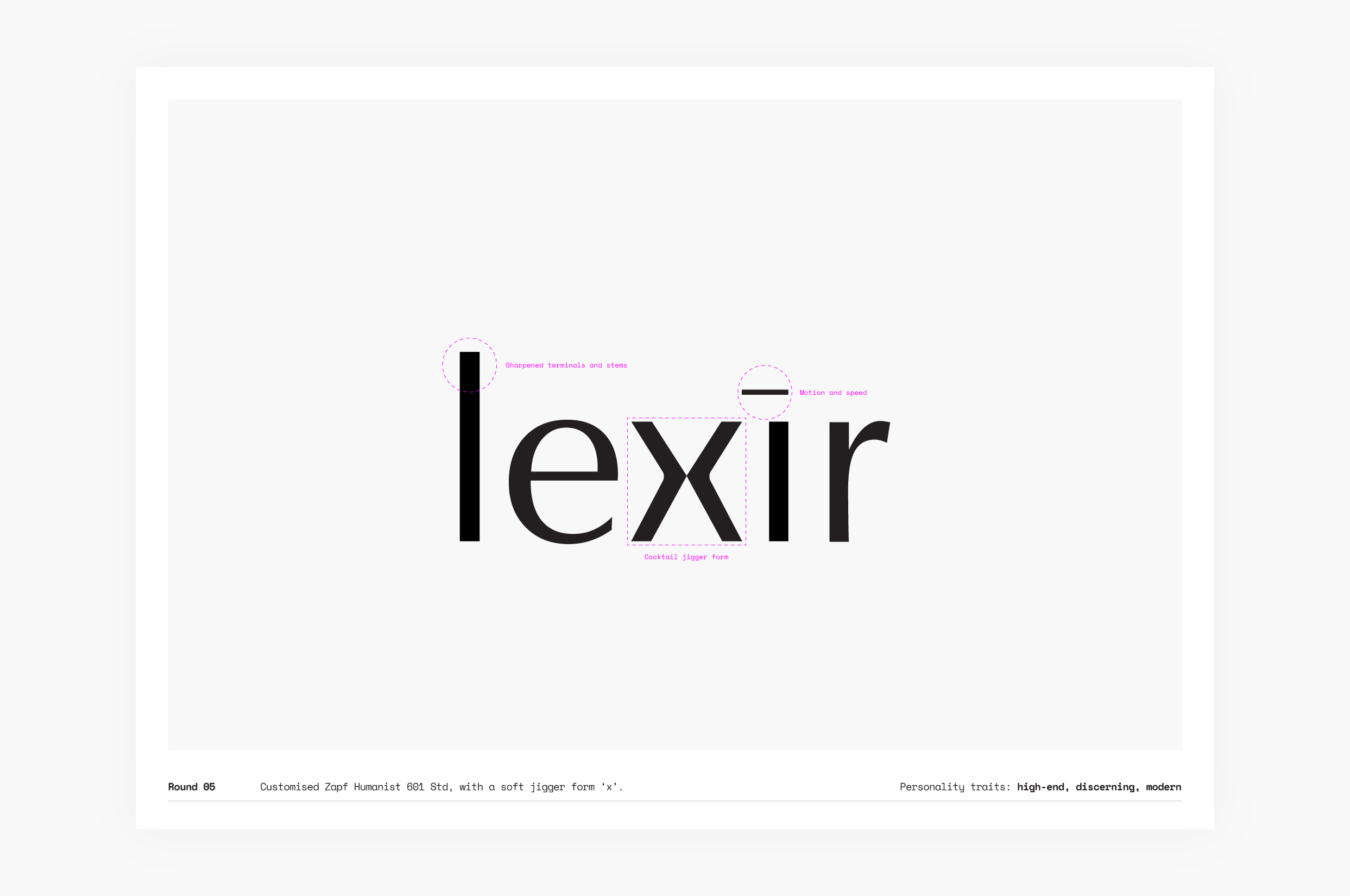
The logo is a key part of Lexir’s visual communication strategy. It needed to communicate a quiet, recessive identity, that would elevate sellers’ brands, while being recognisable—akin to the relationship of a modern gallery space and its artwork.
The resulting logo is defined by its central letter, the x. To express the craft culture of cocktail-making and niche spirits, the letter represents the shape of a mixologist’s ‘jigger’—an alcohol measuring tool.
The logotype uses a heavily customised version of Zapf Humanist 601. A characteristic of humanist fonts is softer curvaceous lines to convey a friendly look. To achieve a high-end, craft-inspired form and reduce the humanist aesthetic, we sharpened the angles of the characters’ terminals and stems, to modernise the elegance and integrity of its original letter-forms.
In the original Zapf characters because the L is taller than the i, the L appears slimmer. To perceive both letters as equal weights and achieve visual balance, we added a fraction more weight to the L.
The dash on top of the i represents motion and speed—synonymous with Lexir’s expertise in developing smart, technology tools for professionals expecting efficiency.
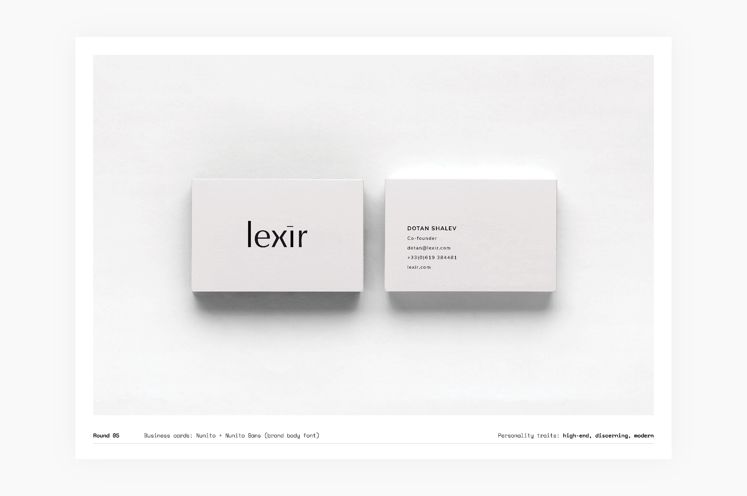
With a new identity that’s attuned with their mission, the final deliverables were logo assets, business card designs, typography and colour guidelines, and a brand strategy.
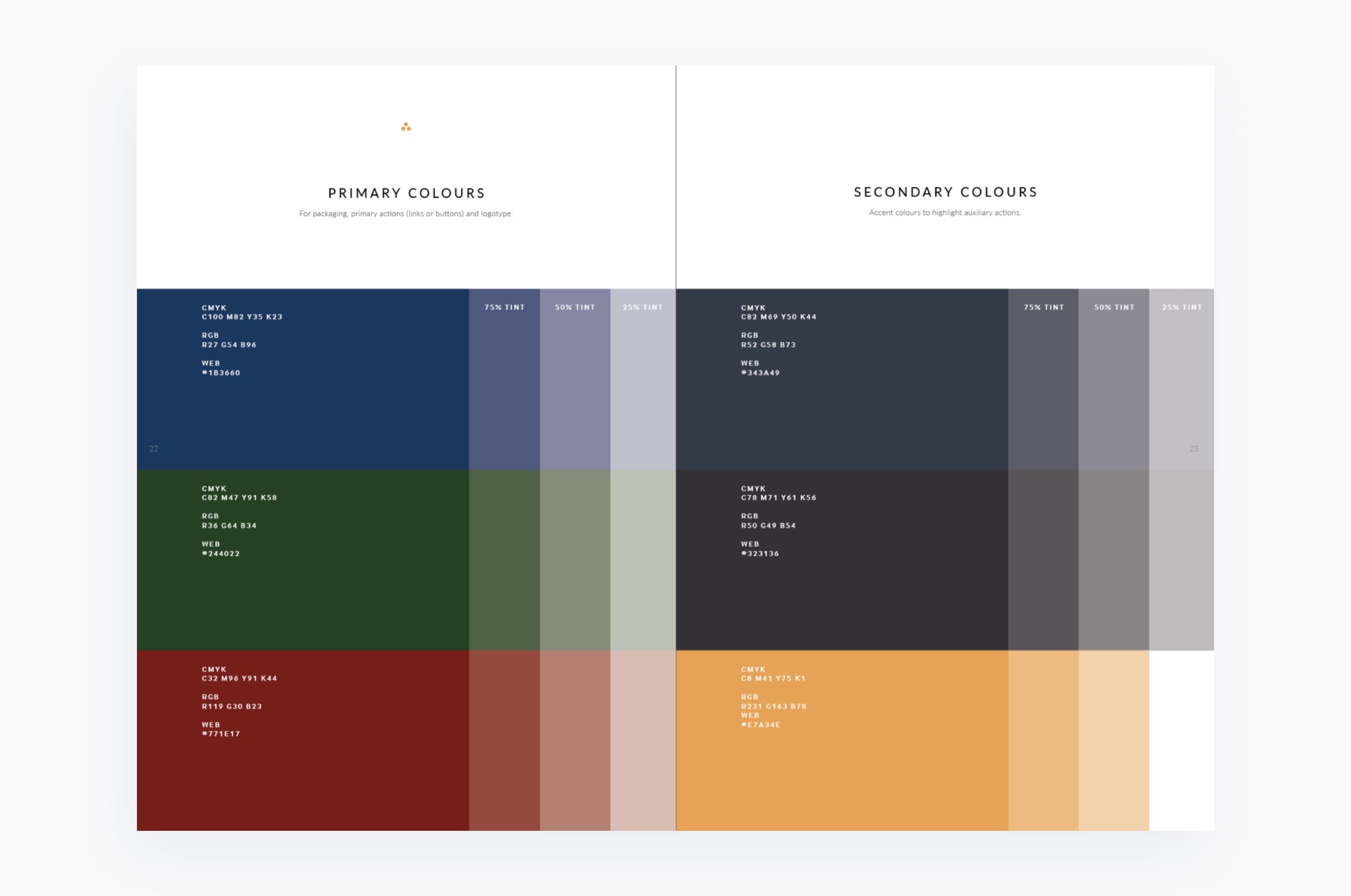
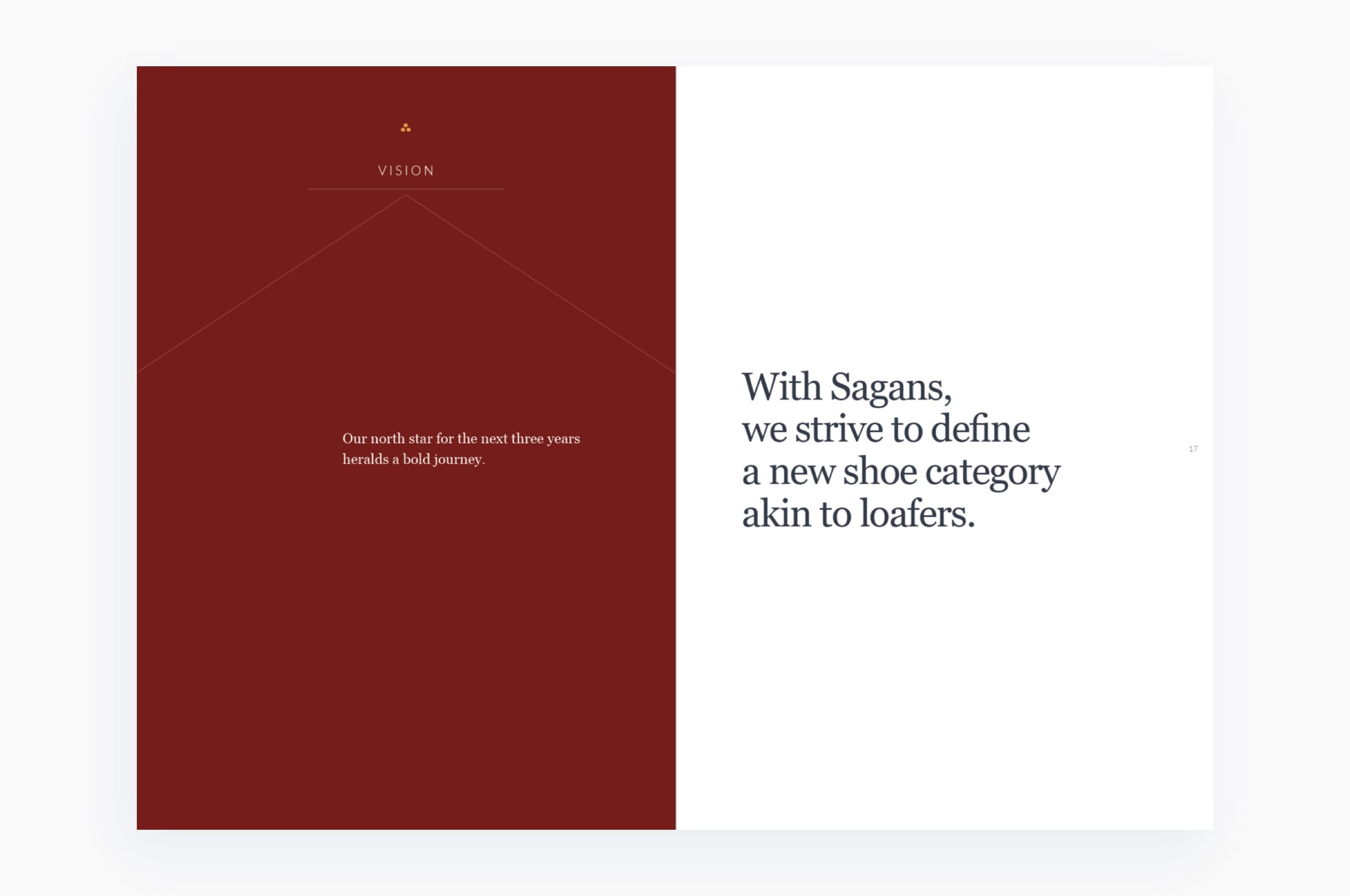
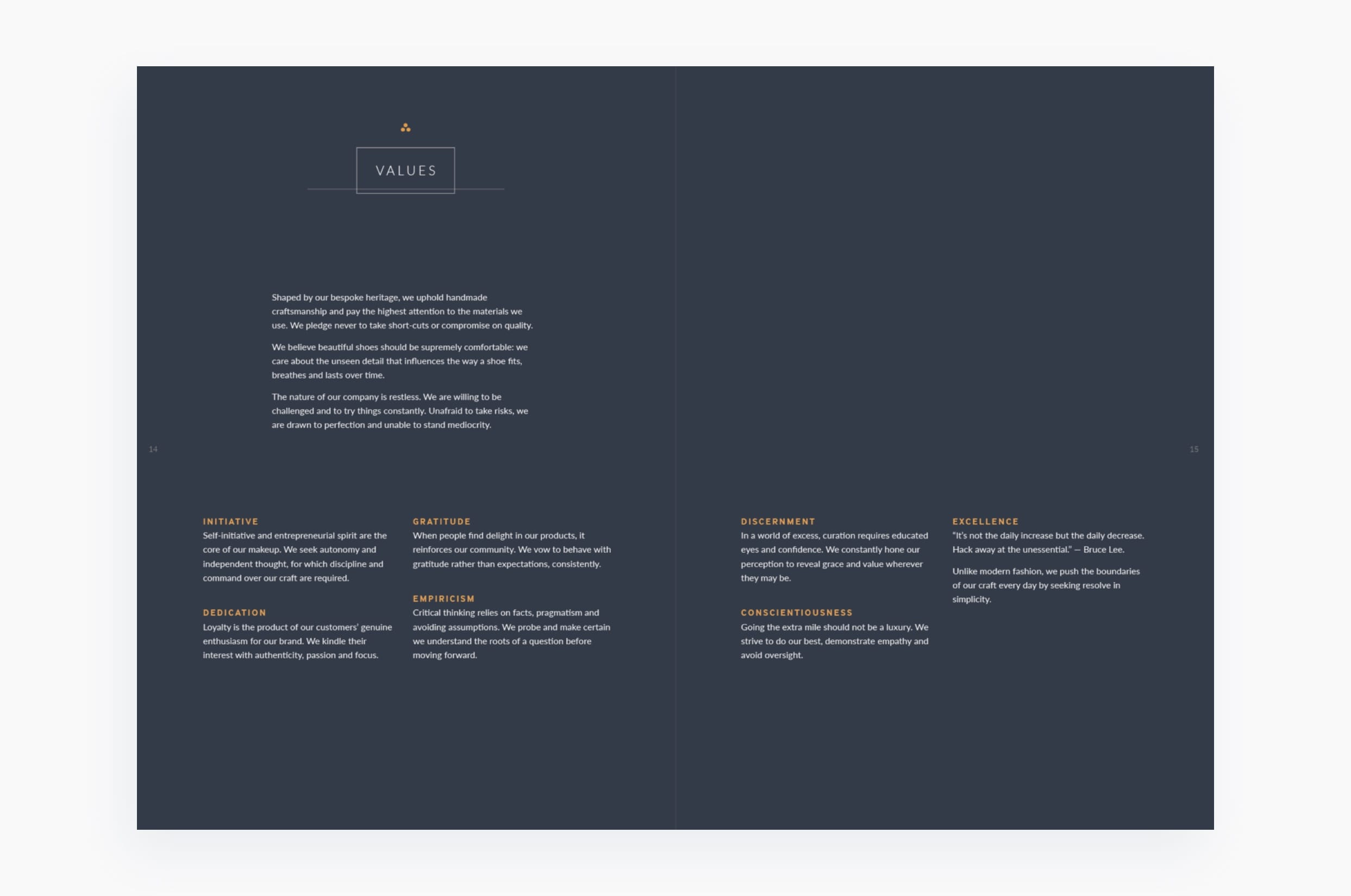
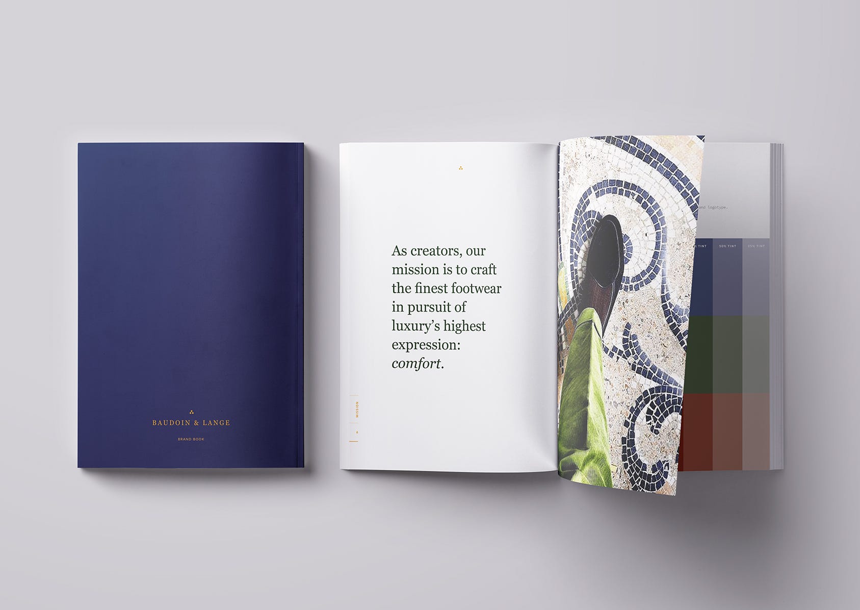
Baudoin & Lange
Finding alignment and improving communication with defined values.
Needs
Baudoin & Lange is a fast-growing handmade Belgian loafer company, based in London. Their objectives for 2018 were to re-platform their ecommerce website, launch in Harrods and Selfridges and build out their team. To achieve this, they needed to find a sustainable long-term pace and to create space to anticipate and establish a universal understanding of their brand culture.
Action plan
Given the full context of the brief, our proposal was to articulate and codify Baudoin & Lange’s brand DNA with a comprehensive brand book that would define their values, mission and vision. This would create a common knowledge of what the company stands for and the direction it's taking, which is both important internally and externally, to:
Make decisions faster.
Cohesively communicate the spirit of the brand to new business partners such as resellers and agencies.
Faithfully represent the brand in PR collateral, build their new website and physical product displays.
Facilitate how they talk about the brand with customers.
Ease the on-boarding of new hires.
In parallel, we brought in some organisational design strategies, to:
Enhance their communication and collaboration systems with new meeting rituals.
Create a company organisational chart and support the description of current and future roles.
Design visual guidelines for creative staff to communicate the brand consistently across all touch-points.
Process
We started by interviewing the entire team, to understand their experience of the brand, their objectives, vision for the company, day-to-day tasks and opportunities for change. We then held a series of eight custom workshops—starting high-level and resolving in a clearly defined and relevant mission. Each session was followed up with a homework task, so individuals could quietly reflect on the workshop’s output (this is important to ensure both extroverted and introverted personalities are heard).
The program was designed as a cascading story-arc, with a clear beginning, middle and end, to coerce rich, relevant information from the team in a succinct and efficient way. We covered exercises in SWOT and competitive analysis, brand makeup, customer journey touch points and storytelling. This culminated in a contextualised understanding of the brand's pain-points, opportunities for improvement, how to position themselves and their direction.
We recorded each session with a write-up of what was discussed, photographs of the post-it boards and a synthesis of the findings. This was managed in a dedicated shared file system, organised for easy reference, for everyone to review and edit at any time.
Impact
The final result was a brand book that visually embodies the collective aspiration for Baudoin & Lange, as well as creating a clear and strategic market positioning. The collaborative process to reach this result improved internal alignment and engagement. Everyone had equal share in the input, helping to build a strong, united team, who is bought into the company’s future.
Chinese resellers have already requested these guidelines to make sure they communicate the brand correctly. The vision, mission and tone-of-voice guidelines have helped to define job descriptions for recruitment, while the story and visual guidelines are helping to commission the website's re-platform. Most importantly however, the company is now clear on what needs to be done and where they are going—together.